To begin, I asked the group to focus on line, shape and tonal value. We used simple objects such as oranges, lemons, curved jars and celery and a strong light source. The aim of cross-contour drawing is to look at the overall shape of each object and use line to draw the surface pattern. It is important to look closely at the areas of light and dark. Varying the pressure of the pencil on paper as you draw each line will show a graduated tone of light, mid and dark tone.

Here is a great example of clear attention to tonal variation within one object. The use of clear and crisp lines with graduating tones makes a confident drawing.


The slightly curved lines highlight the bumpy surface of the grapefruit.


Two beautiful and successful drawings of celery showing clear areas of light and dark tones through line drawing.
Negative and Positive Drawings
I asked the group to complete two drawings this week. Pick an object and observe the overall shape of the silhouette. Ignore all details and just focus your attention on the negative space that surrounds the object.
My aim here is to encourage the participants to get the overall dimensions of the object correct first, before even attempting to look more closely at details.


 Then they looked at the positive space, the object itself. First draw the overall shape, then add details and tonal values.


 I love the different styles that each participant has. They are all so unique, which is great to see!
Pen and Ink
We used pen and ink to explore ways of mark making. I brought along nibs of different thicknesses for experimentation. I showed the group artist examples to explain the variety of marks that can be made. e.g. Van Gogh below!


 It is important to use directional line when cross hatching to show the rounded shape of the pear.
 I like the mixture of ink washes and line used above. There is an obvious attempt to render both tonal value and surface texture. Lets keep practicing!
Colour Colour Colour
It's time to tackle colour using acrylic paint. The group have practiced many tonal and linear studies. I showed them how we can achieve successful tone using colour.
Using a strong light source on the still life will heighten the tonal value.
The lime and asparagus have turned out very well below. You can clearly see the three tones we always discuss: light mid and dark.


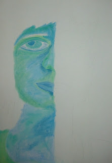
Self Portraits
For our last workshop we created self portraits in the style of Van Gogh. We drew on our knowledge of week 1's contour drawings and week 4/5's pen and ink hatching.
I am so proud of how far the students have come, they really show all their drawing and colour skills in the works below.


Negative and Positive Drawings
I asked the group to complete two drawings this week. Pick an object and observe the overall shape of the silhouette. Ignore all details and just focus your attention on the negative space that surrounds the object.
My aim here is to encourage the participants to get the overall dimensions of the object correct first, before even attempting to look more closely at details.


So impressed with this drawing by our youngest participant who is 11 years old. This object is plastic and transparent, making it even harder to depict the correct tones. And he has done it so well!


Pen and Ink
We used pen and ink to explore ways of mark making. I brought along nibs of different thicknesses for experimentation. I showed the group artist examples to explain the variety of marks that can be made. e.g. Van Gogh below!

We experimented with pure washes of Indian Ink, cross hatched pen lines only, or a mixture of the two.


Colour Colour Colour
It's time to tackle colour using acrylic paint. The group have practiced many tonal and linear studies. I showed them how we can achieve successful tone using colour.
Using a strong light source on the still life will heighten the tonal value.
The lime and asparagus have turned out very well below. You can clearly see the three tones we always discuss: light mid and dark.

Since the still life is made up of mostly green objects, we painted onto red/orange sugar paper. The use of complementary colours really helps the green stand out.


Every artist uses acrylic paint differently, but I show the group how to achieve strong paintings by painting in thin washes/layers. This can keep their paintings fresh and lively!
For our last workshop we created self portraits in the style of Van Gogh. We drew on our knowledge of week 1's contour drawings and week 4/5's pen and ink hatching.
I am so proud of how far the students have come, they really show all their drawing and colour skills in the works below.


Becky, 12 years old

Michael, 13 years old

Rowan, 14 years old

We looked at Picasso's blue period and tried to use cold colours. If we had more time, the other half of the face would have showed warmer colours that Picasso used in this rose period!


No comments:
Post a Comment