Friday 20 April 2012

Fullerton House Printmaking Club

Artist inspired group drawings and monoprints. 
During my recent visit to MOMA in New York, I discovered a few amazing artists. Gert and Ewe Tobias's small monoprints in the printmaking exhibition inspired the following workshop in Fullerton House. 
We began by looking at paintings by Gert and Ewe Tobias. The girls noticed the geometric shapes used to make up each imaginary character and their individual personalities. We made group drawings using the idea of the exquisite corpse. Each person got to draw a head, torso and legs before unveiling the strange characters. 
Looking at artists examples for inspiration. 
The final drawing unveiled!
We then placed acetate on top of the drawing and used it as guide to paint and monoprint onto yellow card.  
Once the painting on acetate is complete, carefully press it onto coloured card and your monoprint is complete. We cut the characters out and placed them on a colourful, geometric background for display.

Henri Rousseau inspired jungle screenprints 
The girls were intrigued by Rousseau's busy jungle paintings so we decided to create our own version. We spent one week screen printing tigers and overlapping firey colours to get interesting skin patterns. 
The second week we used various tones of green and yellow to print leaves. (Plus some sneeky bright pink and blue!) We looked at the abundance of leaf shapes in Rousseau's paintings to help us. We used torn paper to create leaf shapes and layered some to make multi colour leaves. 
Our finished artwork: A collage of busy, bright and vibrant jungle life. 
And even better, Fullerton House are going to frame it and permanently hang it on the school walls for future generations to enjoy!
Favourite final artwork of 2012 so far!

Layered Butterfly Mobiles
Screen printing was such a success we decided to use it again. The girls first designed and cut out butterfly shapes from card. A library book of butterflies really helped our designs. We screen printed using a rainbow of colours, giving us wavy and unpredictable patterns. We also used mini doilies and perforated paper to create patterns.
We attached the butterflies together, added gems and fancy threads for decoration. 

Drypoint: Cross Section Drawings
The pupils were very lucky to use a professional printmaking press borrowed from the Belfast Print Workshop. 
First, the pupils made their cartoon drawings showing a cross section of the sea. They drew a man in a boat and everything underneath. One pupil drew an underwater gym!
They placed acetate on top and used a sharp point to scratch along the lines. 
Once the lines were scratched on, they inked up the acetates and used scrim to rub away excess ink. The 'burr' created by the scratching will hold the ink. Now it's time to print!
We print onto damp paper, which I had soaking in a water bath. 
The big reveal! You can see how the ink has transferred beautifully! The drypointed lines have a soft fuzzy quality. 
So that's the printmaking club finished until next year! 
Best of luck to the Primary 7's and their move to grammar school. Have a great summer!

Cedar Lodge School Youth Art Club

This week we made some fishy fabrics using felt. All the teenagers at Cedar Lodge love the feel of soft marino felt wool, the bubble wrap and soapy suds so it's always a winner. 
First we looked at images of tropical fish. There are so many species, shapes and vibrant colours. We pull and overlap white felt for the background. Then choose a selection of colours to create our fish. The more the fibres overlap, the better it will bind together to form a felt sheet. It looks like a fluffy cloud before the felting process begins. 
This one below is an image of angry birds. Unfortunately I have no 'before' pictures of the fish as we were so busy!
Fantastic tropical fish and angry bird!

Crescent Art Centre: Drawing and Painting for Teenagers: Term 3

 To begin, I asked the group to focus on line, shape and tonal value. We used simple objects such as oranges, lemons, curved jars and celery and a strong light source. The aim of cross-contour drawing is to look at the overall shape of each object and use line to draw the surface pattern. It is important to look closely at the areas of light and dark. Varying the pressure of the pencil on paper as you draw each line will show a graduated tone of light, mid and dark tone. 
Here is a great example of clear attention to tonal variation within one object. The use of clear and crisp lines with graduating tones makes a confident drawing. 
The slightly curved lines highlight the bumpy surface of the grapefruit.
Two beautiful and successful drawings of celery showing clear areas of light and dark tones through line drawing.

Negative and Positive Drawings
I asked the group to complete two drawings this week. Pick an object and observe the overall shape of the silhouette. Ignore all details and just focus your attention on the negative space that surrounds the object.
My aim here is to encourage the participants to get the overall dimensions of the object correct first, before even attempting to look more closely at details.
Then they looked at the positive space, the object itself. First draw the overall shape, then add details and tonal values.
So impressed with this drawing by our youngest participant who is 11 years old. This object is plastic and transparent, making it even harder to depict the correct tones. And he has done it so well!
I love the different styles that each participant has. They are all so unique, which is great to see!

Pen and Ink
We used pen and ink to explore ways of mark making. I brought along nibs of different thicknesses for experimentation. I showed the group artist examples to explain the variety of marks that can be made. e.g. Van Gogh below!
We experimented with pure washes of Indian Ink, cross hatched pen lines only, or a mixture of the two.
It is important to use directional line when cross hatching to show the rounded shape of the pear.
I like the mixture of ink washes and line used above. There is an obvious attempt to render both tonal value and surface texture. Lets keep practicing!

Colour Colour Colour
It's time to tackle colour using acrylic paint. The group have practiced many tonal and linear studies. I showed them how we can achieve successful tone using colour.
Using a strong light source on the still life will heighten the tonal value.
The lime and asparagus have turned out very well below. You can clearly see the three tones we always discuss: light mid and dark.
Since the still life is made up of mostly green objects, we painted onto red/orange sugar paper. The use of complementary colours really helps the green stand out. 
Every artist uses acrylic paint differently, but I show the group how to achieve strong paintings by painting in thin washes/layers. This can keep their paintings fresh and lively!

Self Portraits
For our last workshop we created self portraits in the style of Van Gogh. We drew on our knowledge of week 1's contour drawings and week 4/5's pen and ink hatching.
I am so proud of how far the students have come, they really show all their drawing and colour skills in the works below.
Becky, 12 years old
Michael, 13 years old

Rowan, 14 years old
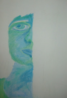
We looked at Picasso's blue period and tried to use cold colours.  If we had more time, the other half of the face would have showed warmer colours that Picasso used in this rose period!